Brand Design
01
Family Dollar Brand Refresh
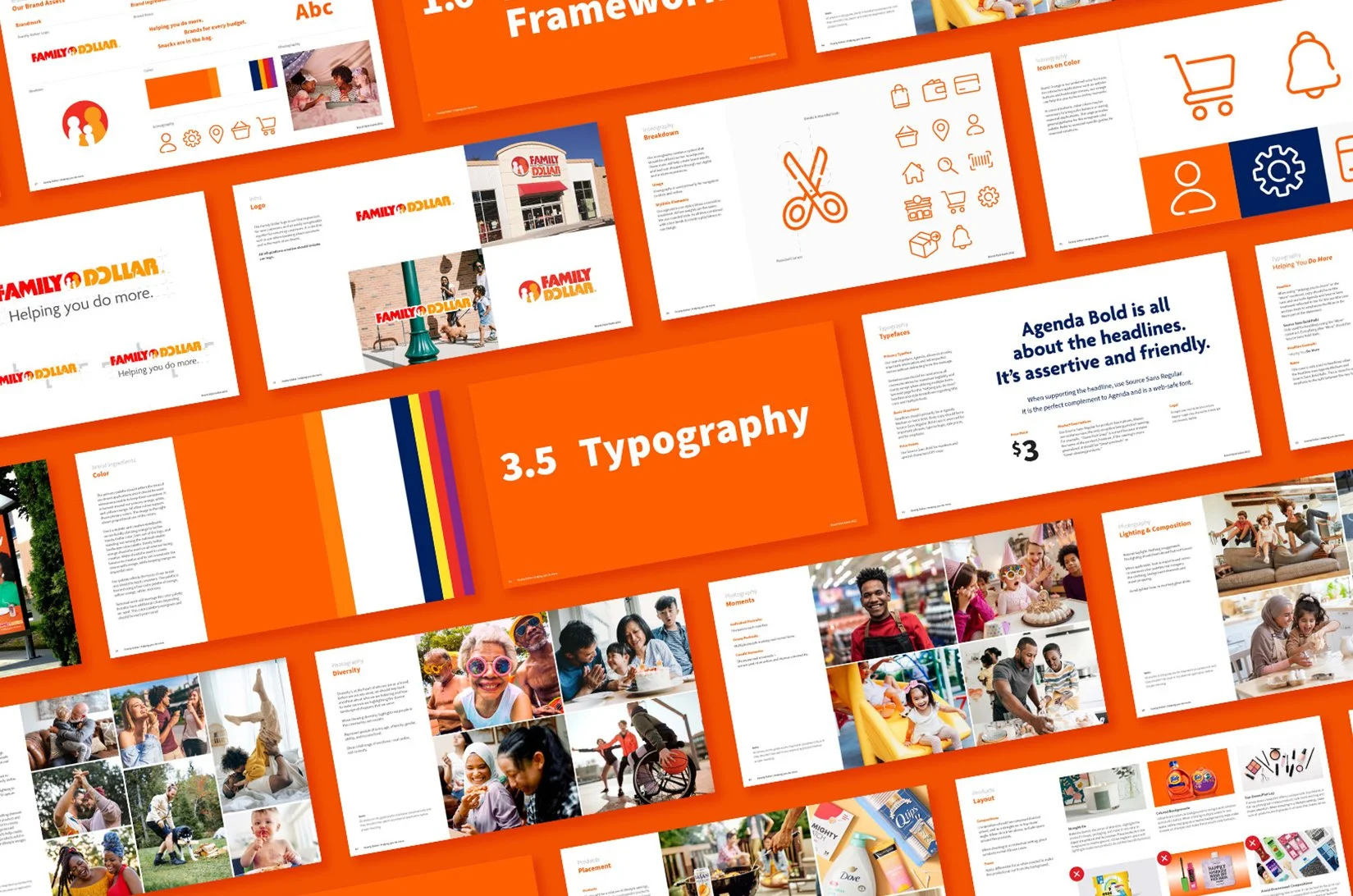
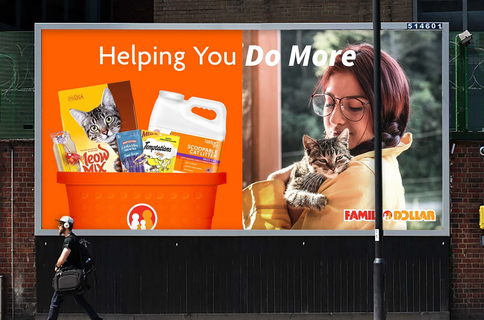
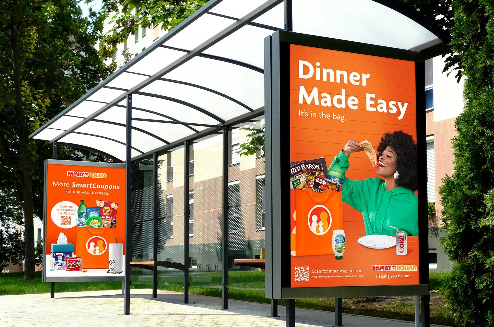
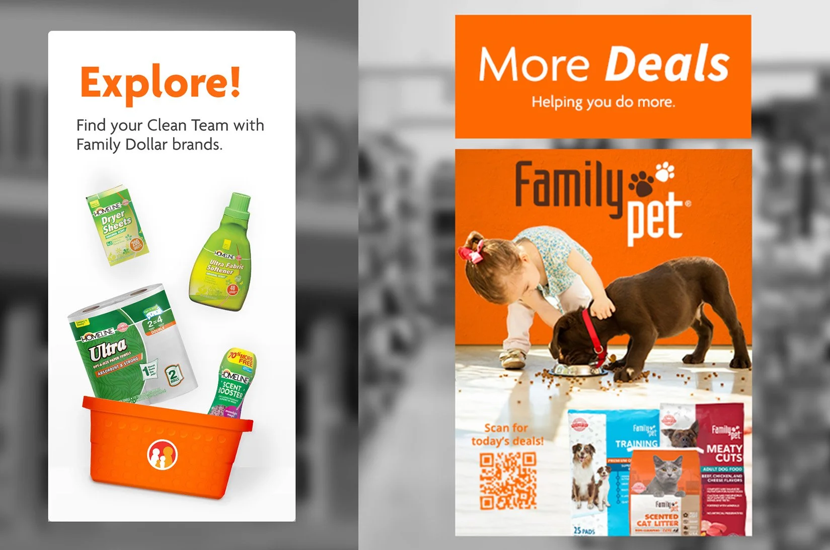
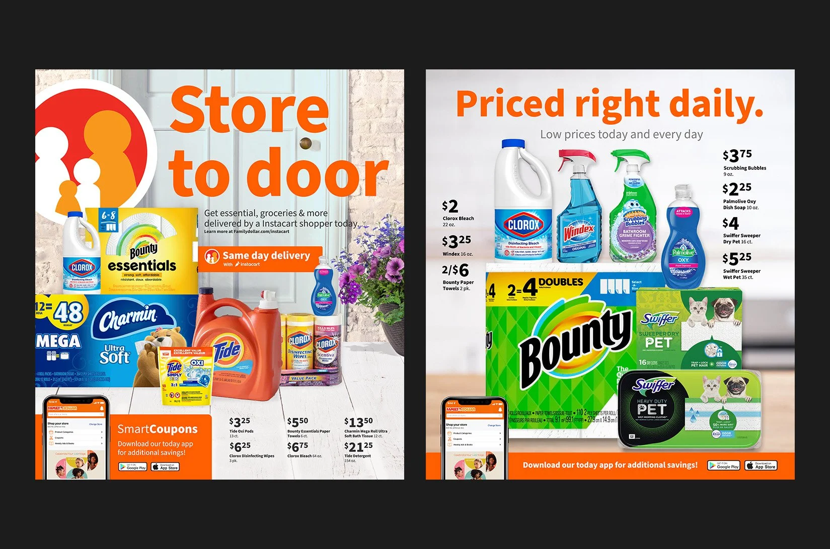
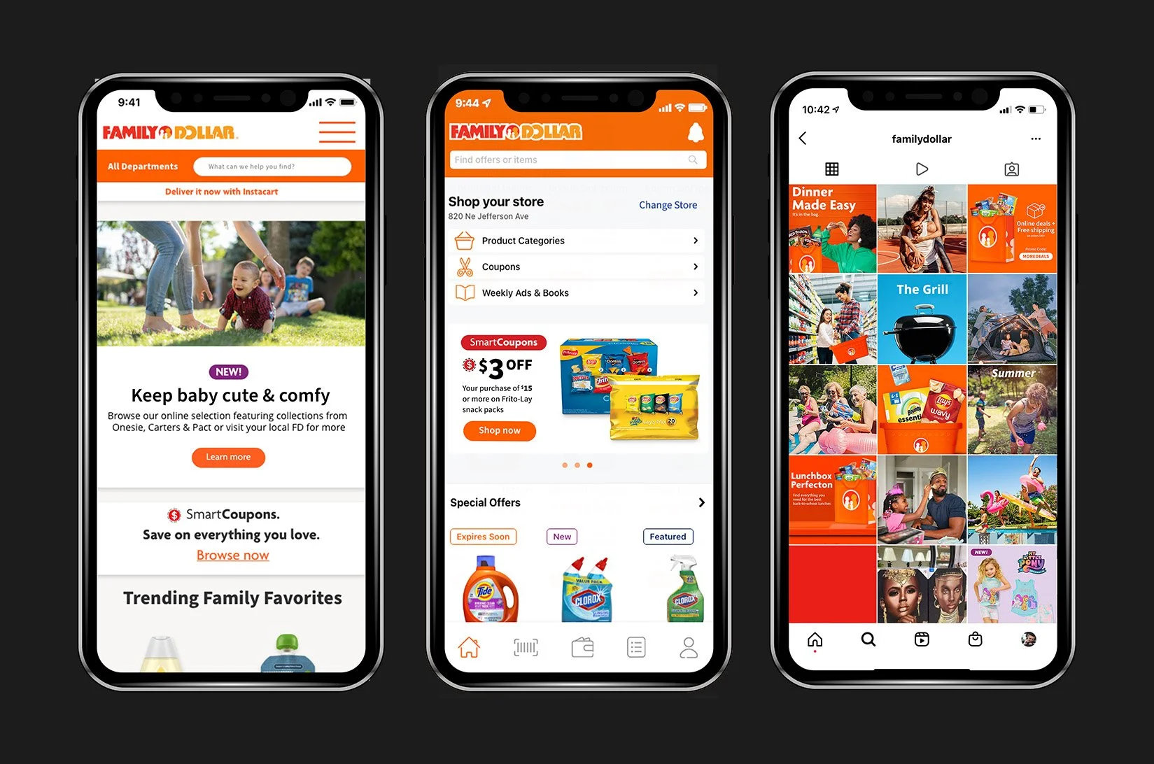
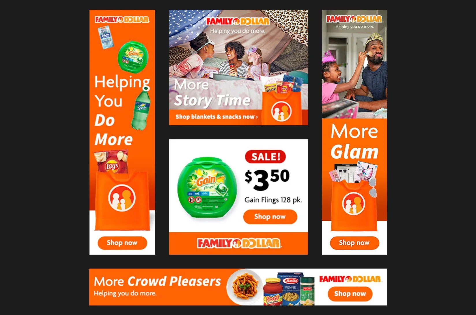
Refreshing a brand like Family Dollar is a beast of a project, and I honestly loved the chaos of it. As the art director, my job was to make sure the entire rollout felt cohesive, which meant owning the visual strategy and helping shape the new brand voice. It was all about sweating the details. From the initial concepts to finalizing every piece of collateral, I had my hands on it all. Ensuring that the new design translated perfectly from digital to physical spaces was a massive challenge, but it completely changed the way the brand showed up in the world.
Art Direction & Design
02
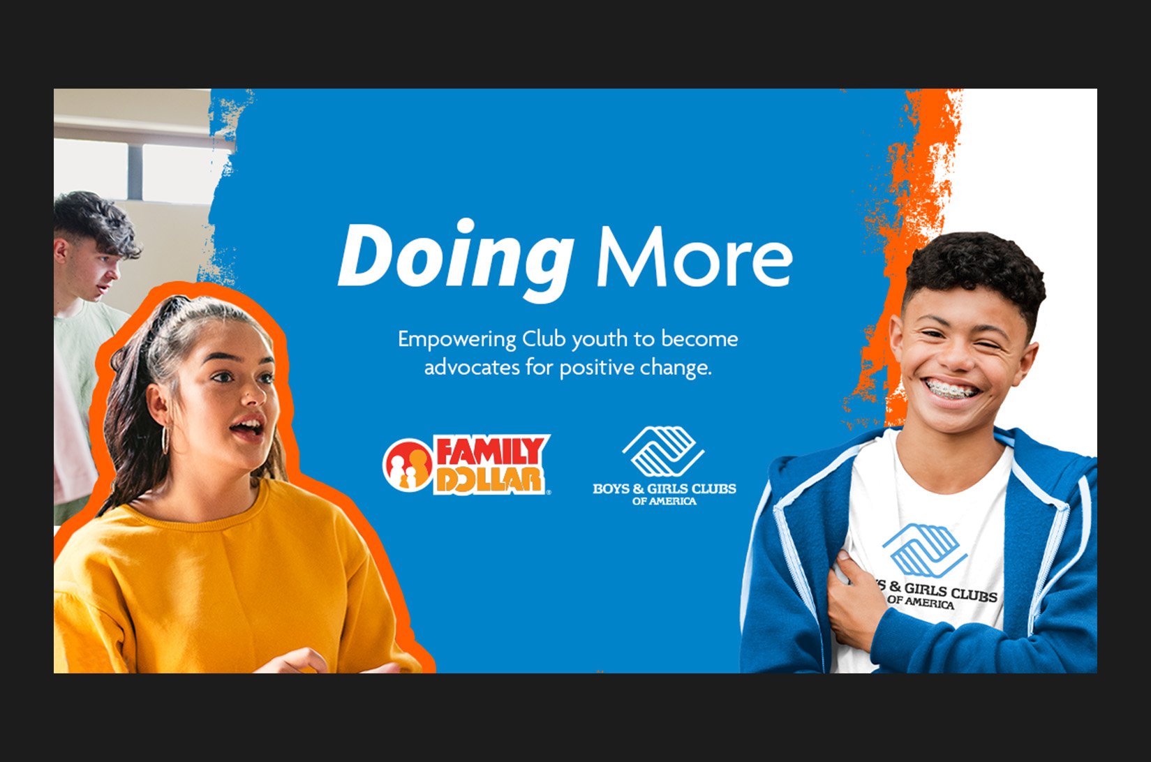
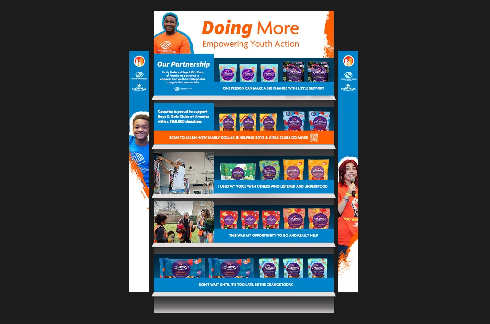
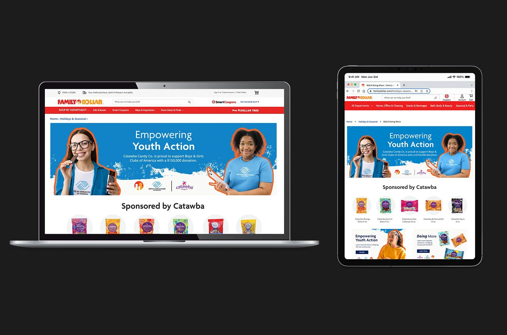
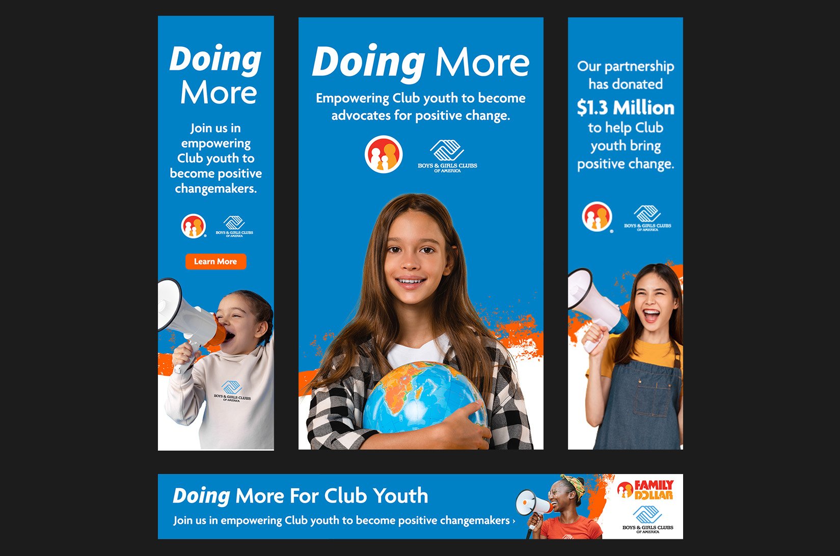
Family Dollar BGCA Partnership
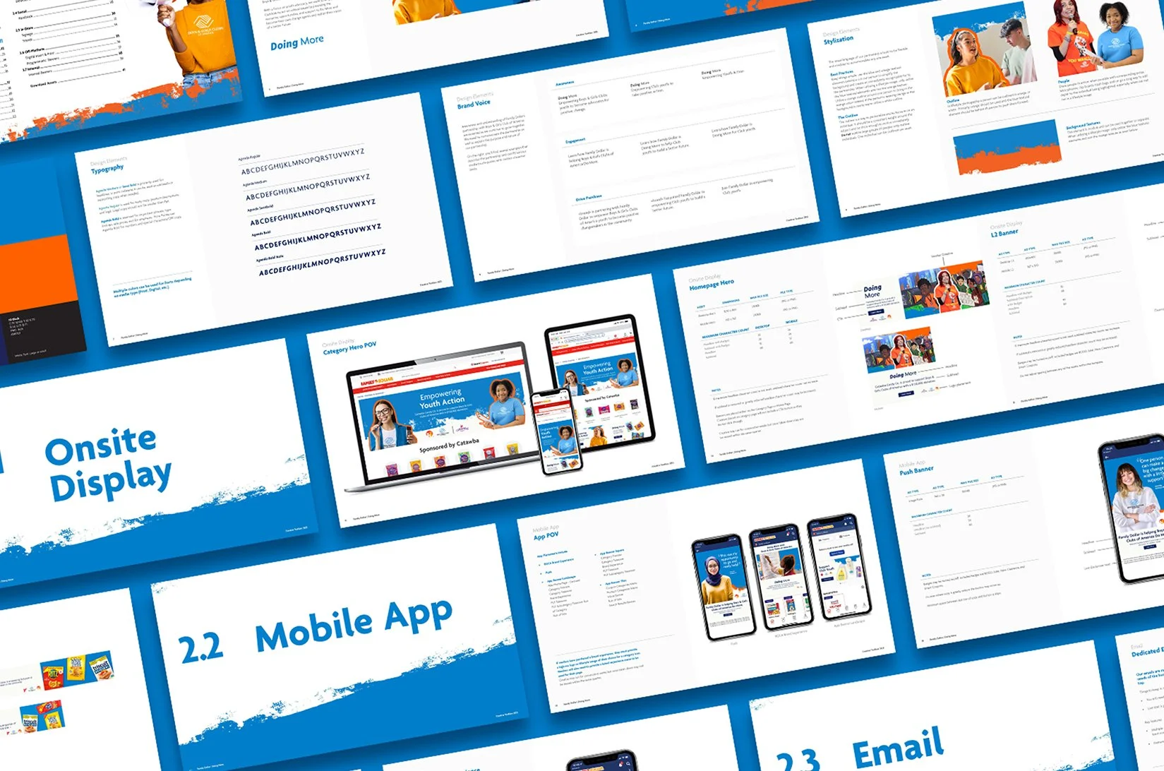
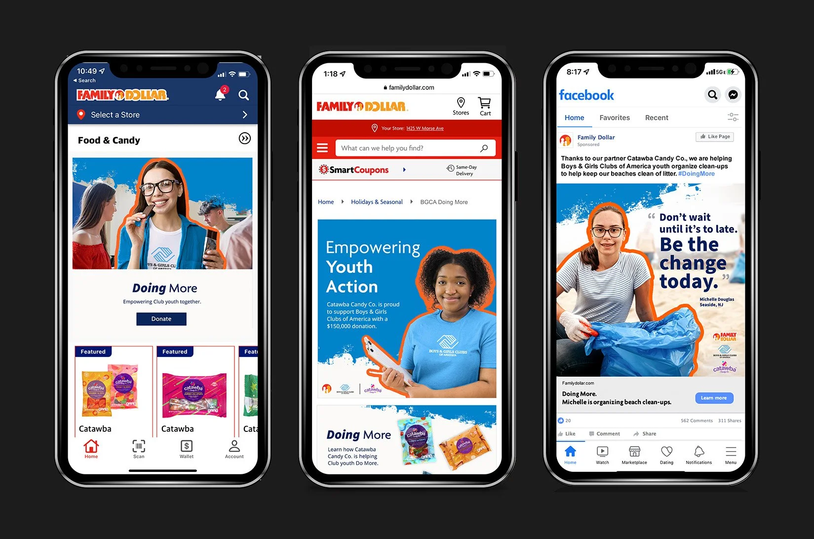
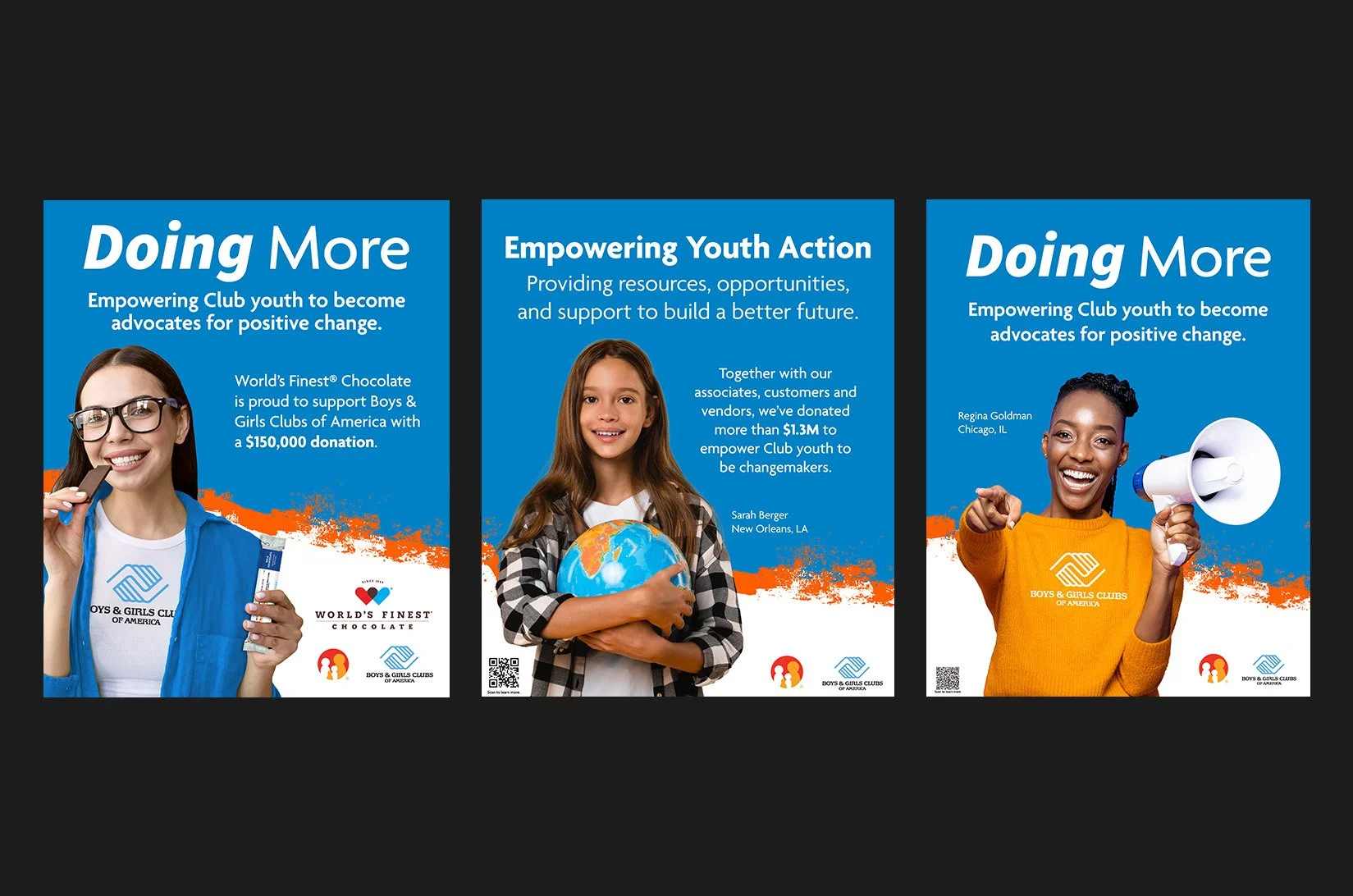
Partnering with the Boys & Girls Clubs of America was one of those projects where you actually feel the impact of the work. For this project, the challenge was figuring out how to merge two completely different brand voices into one cohesive, authentic look. It wasn't just about slapping a couple of logos together on a page; it was about telling a story that mattered. From concepting the initial visual strategy to pushing out the final campaign deliverables, we wanted to make sure everything we built felt genuine and actually highlighted the good being done in the community.
Art Direction & Design
03
Violife Retail Toolkit
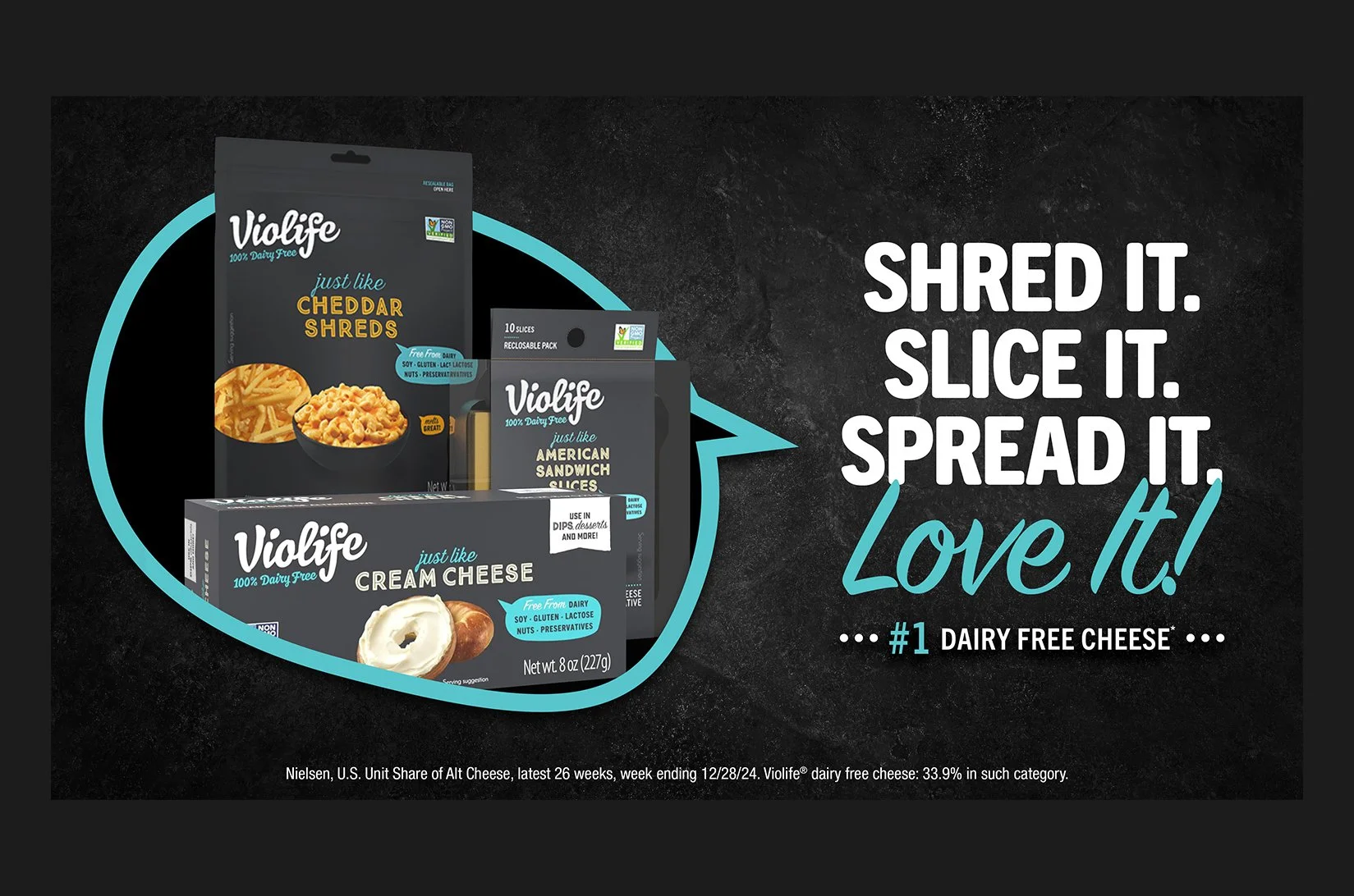
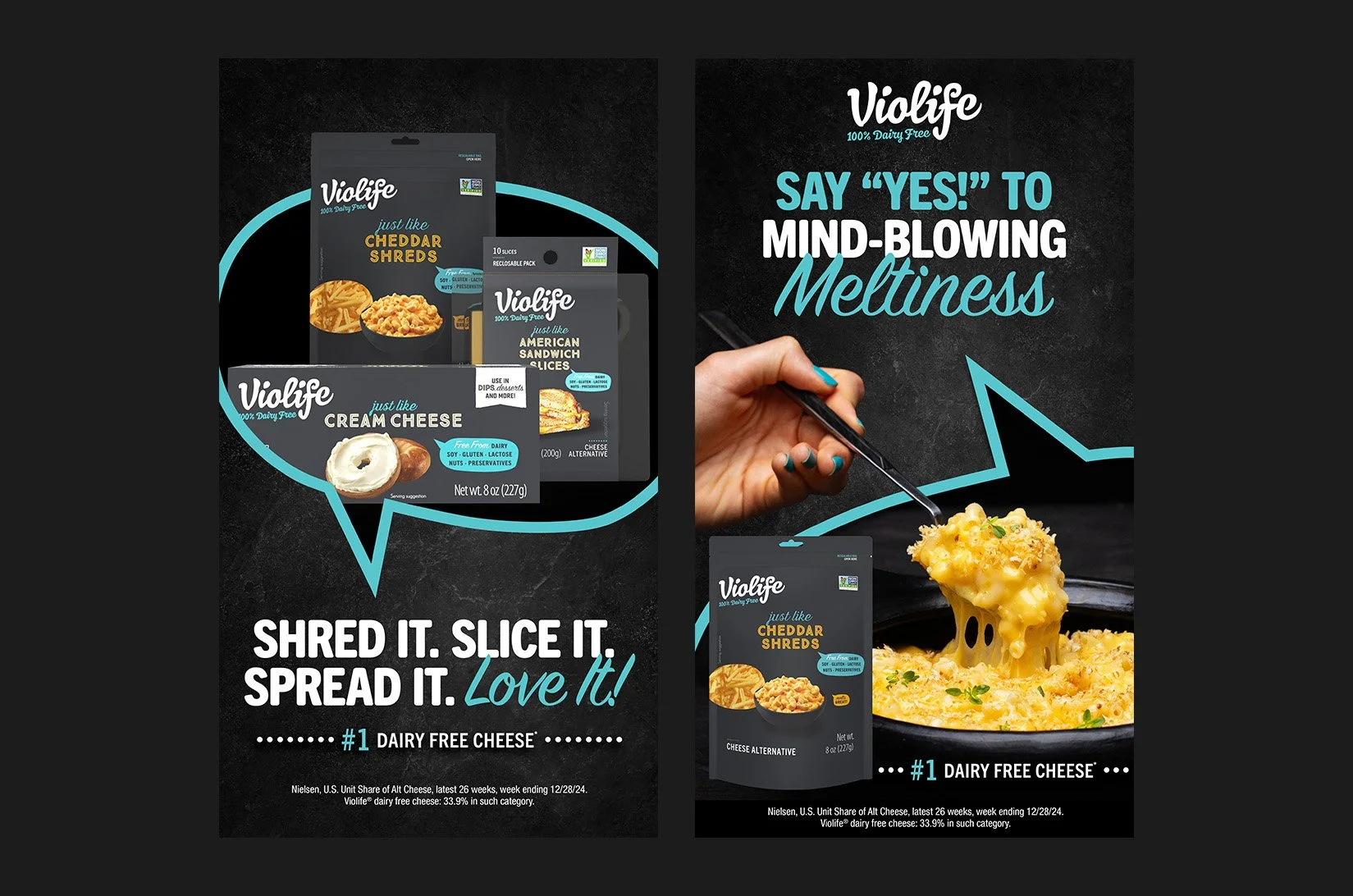
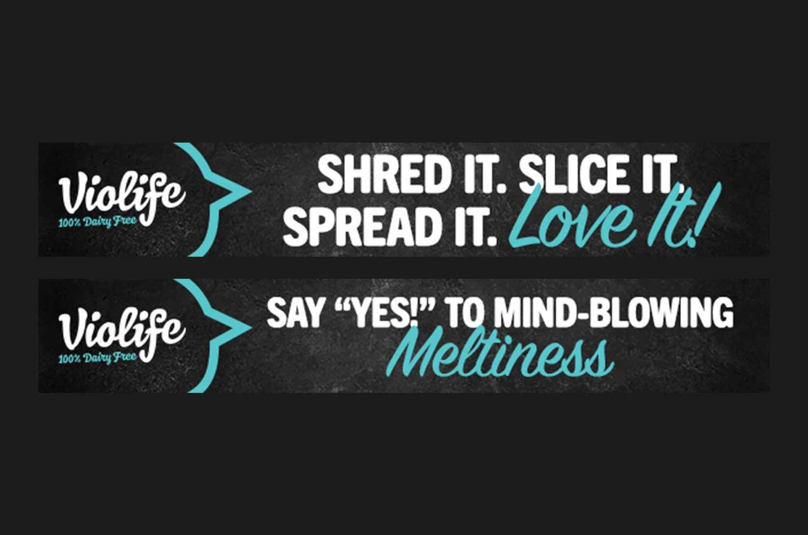
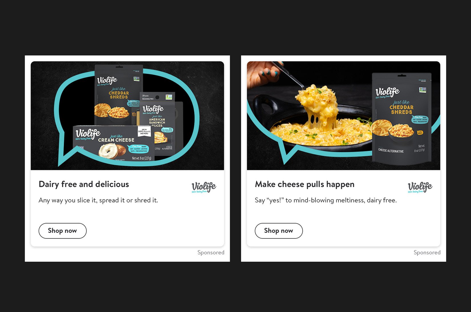
For the Violife retail toolkit, I focused on dialing in the key visuals. This is where the actual heavy lifting happens. You have to establish a core look that is strong enough to anchor the brand, but scrappy and flexible enough to be ripped apart and reassembled for every weird, unpredictable in-store placement imaginable. It was a really fun exercise in building a highly adaptable visual foundation that the rest of the marketing materials could confidently lean on.
Art Direction & Design